Frequent Print Exercise 7
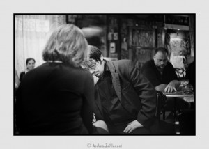
Die Bar II
Vodoo is still with us as of 2013. The Yashica GSN which signs responsible for this one is long gone, but sometimes I do miss her. 45 1.7, mmh.
This was also quite easy to get “right”. The quotes are there because what is right can be quite subjective within a certain range. Here, I faced one challenge: the face. And maybe the bright curtain in upper left corner.
First: the face looked right on the screen, but too bright on the print. Which is not often the case – usually it is the other way around. Learning how I want a face to render is one integral part of my printing-learning-experience. I think I am not 100% there, and knowing that aesthetic judgments change over time, I am not sure about the finite nature of the goal. Btw., speaking of faces I actually mean the brightness, shades and contrast in the skin-tone. I am not even thinking about color here, God help us!
Second: the curtain in the background is tricky insofar as it is on the verge of blowing out. The natural reaction one would think of here is to burn in the highlights. But to me this starts to look unnatural too easily – kind of greyish and dull. Because by burning in bright areas you cannot magically introduce detail – there is none to start with. So I prefer to let them _almost_ blow instead of turning into a grey mess. Lesson learned.
Speaking of changing judgments, I highly value the time-span between the taking of a picture and the printing. I often wonder when people deal with recently produced work, as often seen on blogs, especially travel features. The impact of fresh (and positive) memories dilutes the discerning eye. Fruits on a market booth are not interesting sui generis, imho. But then, a sleeping drunk ain’t either ![]()
I think that I can say more about the role that time plays in photography (the editing process) at a later point.


